This page shows how I frame questions, clean data, compare models, explain results, and
keep private work private. School projects include more method detail; employer and
client-style consulting examples use synthetic data or generalized labels.
Featured R/RStudio project
Taxi fare pricing analysis.
A group final project for OPIM 5603 - Statistics in Business Analytics, built in
RStudio and R Markdown. Responsibility was shared across the project; my main
contribution was the random forest model and evaluation section.
What the project did
The project analyzed a 1,000-row taxi pricing dataset with 11 original fields. As a
group, we moved through cleaning, feature engineering, visualization, regression
modeling, random forest comparison, diagnostics, and interpretation. My main section
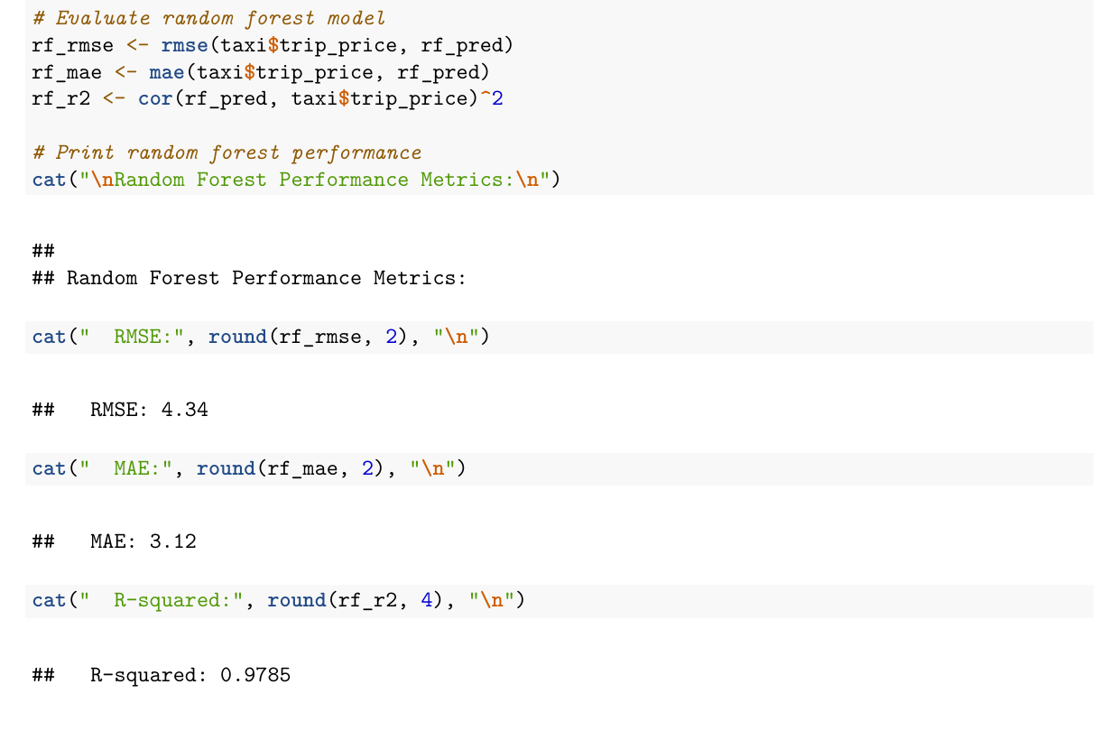
focused on fitting the random forest model and evaluating RMSE, MAE, and R-squared.
The image shown here is an actual excerpt from that random forest section of the
knitted R Markdown report.
This is group coursework evidence, not a deployed pricing system. The random forest
result is presented as an in-project model comparison, not a production validation
claim.
Distance mattered, but one predictor left too much unexplained.
Multiple regression
15.22
11.91
0.5796
Distance and trip duration were the strongest interpretable drivers.
Random forest
4.34
3.12
0.9785
Nonlinear modeling fit the project dataset much more closely.
Skills shown
Data cleaning, feature engineering, exploratory visualization, regression
interpretation, model comparison, diagnostics, and communicating results in a
reproducible report.
Personal takeaway
Funny enough, working with black-and-white numbers has taught me a lot about creative
thinking. It pushed me to look at business issues less linearly: what is connected,
what is missing, and what question should come next.
Business interpretation
The analysis identified trip distance and duration as the clearest fare drivers, with
traffic, weather, and engineered speed adding useful context around trip efficiency.
AI assistance
I used AI the way I use a second set of eyes: syntax help, debugging, and
pressure-testing explanations. The judgment still had to be mine: choosing the
question, validating outputs, and explaining what the results mean.
Additional Python project
Credit default risk modeling.
A group final project for OPIM 5603 - Predictive Modeling, built in Python. Work was
shared across the team; my section focused on the Random Forest classifier and the
model-comparison assessment.
What the project did
The project used a 30,000-row credit-card default dataset to predict whether a client
would default the next month. As a group, we moved through sampling, exploration,
feature preparation, model building, and assessment. My main section fit the Random
Forest model and helped compare test-set ROC AUC across candidate classifiers.
This is group coursework evidence, not a deployed credit-decisioning system. The
metrics are presented as in-project validation results, not a production lending or
underwriting claim.
Strong tree-based comparison model with competitive discrimination.
XGBoost
0.8075
0.6114
0.3557
0.4497
0.7518
Similar ROC AUC to Random Forest with a different precision-recall balance.
Neural Network
0.8180
0.7102
0.2992
0.4210
0.7700
Highest ROC AUC in the project, with lower recall at the default threshold.
Logistic regression with interaction
0.8152
0.7034
0.2841
0.4047
0.7165
Useful interpretable baseline for comparing more flexible classifiers.
Skills shown
Train/validation/test splitting, feature scaling, PCA for correlated billing
variables, classifier fitting, model comparison, ROC AUC interpretation, and clear
communication of validation results.
Business interpretation
The model comparison framed default prediction as a risk-ranking problem, where
accuracy alone is not enough and recall, precision, F1, ROC AUC, and lift all matter.
My role
The project was completed by a group. My main contribution was the Random Forest
model and the model-comparison assessment shown here.
SQLite / healthcare analyst practice
Healthcare analyst practice database.
A synthetic SQLite database from the Elite Healthcare Analyst Compendium, built for
hands-on practice with healthcare SQL, table grain, quality measures, ED throughput,
claims analysis, risk scores, and analyst validation habits. The workflow is local and
reproducible: inspect the database in DBeaver, run saved SQL, reconcile counts, and
explain the operational meaning.
What the project models
The practice database contains 25 tables and 10 views across synthetic patients,
encounters, departments, providers, diagnoses, labs, vitals, pharmacy fills, claims,
coverage, care gaps, attribution, risk scores, and outcome labels. It supports the
core analyst questions behind healthcare operations work: which populations are in
scope, which rows define the denominator, where denials or care gaps concentrate,
and how to validate a result before turning it into a dashboard or recommendation.
This is a synthetic study database, not a live clinical, claims, or payer system. It
contains no PHI and no real employer or patient data. The claim is limited to the
database design, SQL practice workflow, DBeaver inspection, and analyst explanation
shown here.
SQLite claims-denial query
SELECT
  p.payer_type,
  c.claim_status,
  COUNT(*) AS claim_count,
  ROUND(AVG(c.denial_flag), 3) AS denial_rate,
  ROUND(SUM(c.allowed_amount), 2) AS allowed_amount,
  ROUND(SUM(c.paid_amount), 2) AS paid_amount
FROM financial_claim AS c
JOIN financial_coverage AS cov
  ON c.coverage_id = cov.coverage_id
JOIN ref_payer AS p
  ON cov.payer_id = p.payer_id
GROUP BY p.payer_type, c.claim_status
ORDER BY denial_rate DESC, claim_count DESC;
25 tables and 10 views with 2,000 synthetic patients, 6,996 encounters, 6,996 claims, and 4,068 care-gap rows.
Gives enough density to practice healthcare SQL while keeping the dataset inspectable and safe for public portfolio use.
Schema discipline
Separate schema, index, view, and reference-data SQL files with explicit table-grain comments and foreign-key relationships.
Shows the difference between source-table structure, analytic views, and saved practice queries.
DBeaver workflow
Connect to the local SQLite file, browse tables and views, run saved SQL, inspect result grids, and validate grouped outputs.
Mirrors the practical analyst habit of checking structure before trusting a dashboard or exported result.
Practice outputs
Patient counts, encounter mix, care-gap status, ED throughput, claim denial pressure, risk profiles, and future-ED modeling table SQL.
Connects SQL mechanics to operational questions around quality, access, utilization, finance, and population health.
Role signal
Shows healthcare analyst fundamentals: source-table inspection, denominator logic,
claims and care-gap questions, operational metrics, and clear SQL validation.
Workflow discipline
Starts in DBeaver, checks table grain, runs saved SQL, reconciles grouped counts to
source tables, and keeps reusable queries in the compendium SQL folder.
Reports supported
Care-gap status, claim denial pressure, ED throughput, outpatient access,
inpatient length of stay, patient risk profile, and modeling-table preparation.
Public boundary
This is a local synthetic practice database from a private study bundle. It is not a
production medical record, payer, or revenue-cycle system and contains no PHI.
Public dashboard view
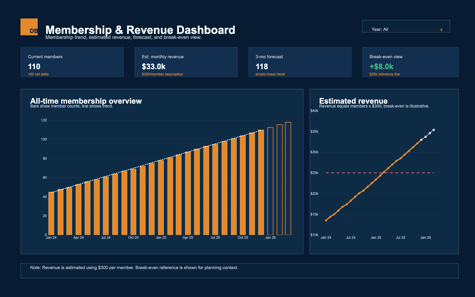
A private owner dashboard, shown safely.
The original setup was Square -> Zapier -> Google Sheet -> Python dashboard. Square
activity flowed through Zapier into a private Google Sheet, then a Python Dash app used
Plotly charts, Pandas data prep, and linear regression to turn that spreadsheet activity
into interactive membership and revenue views. I also built an R Shiny version that
read from a private Excel workbook in RStudio and added a year filter. I built and
presented a shinyapps.io version, but it did not match the owner's privacy concerns,
so the public portfolio uses a synthetic static view instead.
Data pipeline
Square transaction activity moved through Zapier into a private Google Sheet, then into the Python dashboard
Local prototype
R Shiny read a private Excel workbook, filtered by year, and plotted monthly membership trend with ggplot2
Business purpose
Help a small-business owner see membership trends, estimated revenue, short-range forecasts, and break-even context
Public visual
The public image uses synthetic data with the same Pandas, regression, Plotly, and Dash-style charting flow, then exports as a static PNG
Privacy boundary
Live sheet access, real member counts, company names, and private operating details are removed
Python
Dash
Plotly
Pandas
Linear regression
R Shiny
RStudio
ggplot2
shinyapps.io
Square
Zapier
Google Sheets
Excel
Forecasting
Synthetic data
Privacy
Public display uses synthetic data; no real employer, client, member, or source spreadsheet records are shown.